
A Classic in Full Color
Cape Cod Home / Spring 2026 / Home, Garden & Design
Writer: Julie Craven Wagner / Photographer: Neil Landino
A Classic in Full Color
Cape Cod Home / Spring 2026 / Home, Garden & Design
Writer: Julie Craven Wagner / Photographer: Neil Landino
With architecture by Patrick Ahearn and interiors by Allison Mattison, this Edgartown compound embraces a spirited Americana palette—layering blues, reds, and timeless design to create a vibrant, multi-generational retreat.
From the street, the home feels as though it has always belonged.
Set behind a crisp white picket fence along one of Edgartown’s most picturesque stretches, a new residence carries the quiet authority of a house rooted in history—balanced, symmetrical, and unmistakably New England. Brick pathways echo the village sidewalks, guiding visitors toward a front façade that feels both familiar and enduring. Yet, this sense of permanence is entirely intentional.
In place of what was once an unassuming ranch set back on a rare double lot, a new vision has taken hold—one that brings the home forward, both physically and emotionally, into the rhythm of the street. Where the previous structure receded, this one engages, establishing a dialogue with its surroundings that feels authentic to Edgartown’s architectural legacy.
“It was a property you could walk by a hundred times and not really notice,” says interior designer Allison Mattison of Trellis Home Design, “yet of course it was an integrated part of the neighborhood, so careful attention was paid to making sure the neighbors felt comfortable with what was newly evolving. Now it feels like it’s always been there—it has presence, it has purpose.”
That transformation begins with the architecture of Patrick Ahearn, whose work is known for its ability to honor tradition while quietly elevating it. Here, his design does more than replace a structure—it restores a sense of place. He explains how he imagines structures that accomplish far more than just providing shelter, “I like to consider how a home fits in the context of the streetscape in every town or village. I call it the ‘Greater Good Theory.’ Basically, you take the program which can be very significant, and break it into pieces. Then it’s not just one large house, but rather structures that have independence, while also being inter-related. But it is the study of the character, the scale and the details, that lead you to create a house that’s invisible as it becomes part of the ensemble of the established environment. To me, that is probably the most important thing.”
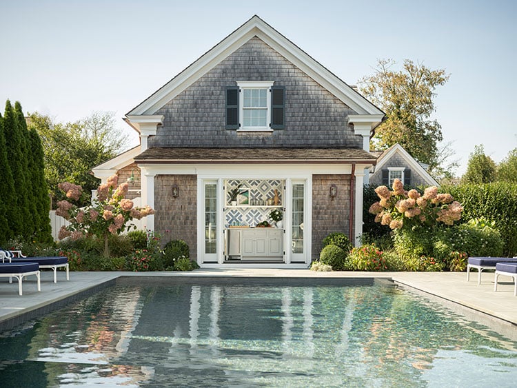
Beyond the main house, the property unfolds into a thoughtfully composed compound. A three-car garage anchors one side, discreetly oriented away from the street, while a pool cabana—integrated into its rear elevation—faces inward toward the heart of the property. Nearby, a separate guest house nestles into the landscape, offering both privacy and continuity. Together, these three structures perform four distinct functions, all centered around a shared outdoor space that becomes the nucleus of daily life.
At its core, this is a home designed for generations.
The homeowners, longtime Vineyard devotees, recognized the opportunity to create something more expansive when the lot became available. With a growing family and an active lifestyle that brings children, grandchildren, and friends together throughout the seasons, they envisioned a place where everyone could gather without compromise.
“They already had a house nearby, but they were outgrowing it,” Mattison explains. “This was about creating a home where three generations could be together comfortably—and where they could entertain and really enjoy being here.”
And from the earliest conversations, one thing was clear: this would be a home defined by color.
An Americana Palette, Refined
For Mattison, whose work often embraces a full spectrum of hues, the direction here was both specific and nuanced.
“The clients really loved red, white, and blue,” she says.“They wanted that Americana feeling—but not in a way that felt obvious or themed. It had to feel elevated, comfortable, and natural.”
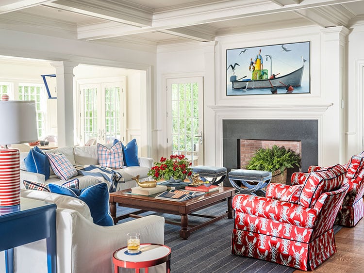
Blue became the grounding force—an anchoring presence that moves seamlessly from room to room, echoing both sky and sea. From there, red was introduced with restraint and intention, acting less as a dominant color and more as a strategic accent—punctuating spaces, energizing compositions, and creating moments of visual delight.
“Red is one of my favorite colors,” Mattison says. “It’s strong, and people can be hesitant about it. But when you use it in the right way, it brings life to a space. It makes everything feel more vibrant.”
This careful calibration is what gives the home its distinctive rhythm. Rather than overwhelming the eye, the palette unfolds gradually—layered through textiles, finishes, and details that reveal themselves over time.
“It’s very much about saturation and balance,” she adds. “You don’t want everything shouting at you. You want it to feel cohesive and intentional.”
Bedrooms with Personality and Purpose
The private spaces of the home reflect both the individuality of the family and the broader narrative of the design.
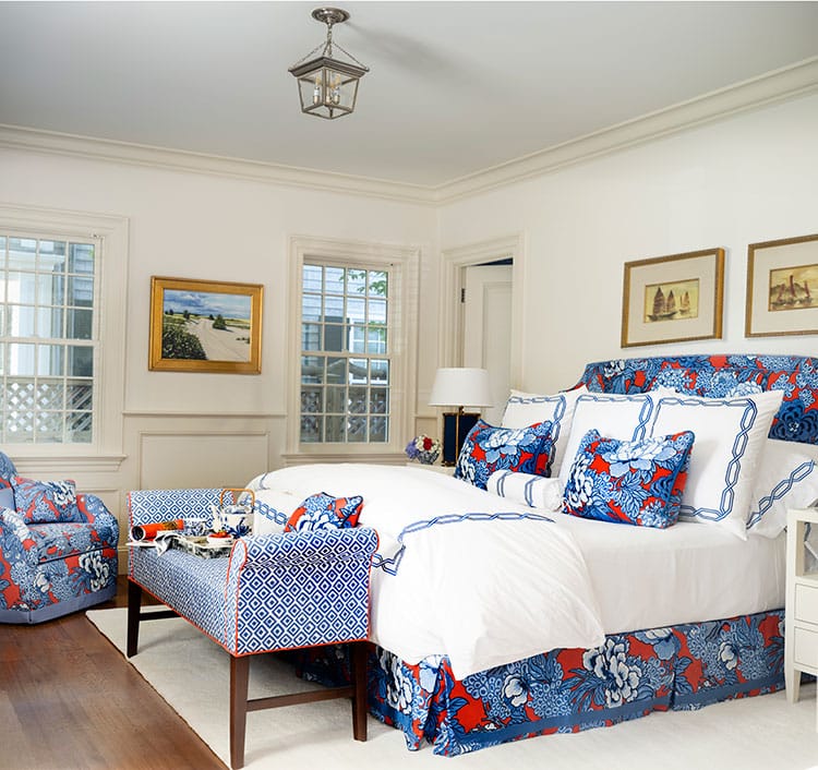
On the ground floor, the primary suite offers a retreat that is as practical as it is inviting. Designed with accessibility in mind, it allows the homeowners to live comfortably on one level while remaining fully connected to the rest of the house.
Here, the Americana palette takes on a softer tone—floral patterns in red and blue layered across bedding and upholstery, complemented by tailored details that lend a sense of quiet sophistication. The effect is restful, yet distinctly tied to the home’s overall identity.
Upstairs, the mood shifts subtly, embracing a more playful and varied expression of color.
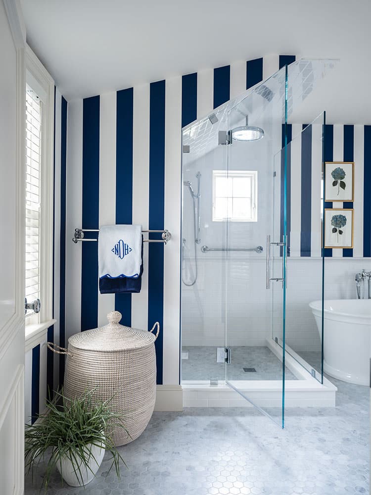
A blue-and-white striped guest suite greets visitors with crisp, classic charm, while another bedroom introduces unexpected notes of pink and orange—an expansion of the palette that feels fresh without straying from the core aesthetic. Twin rooms, outfitted with bamboo headboards and cheerful red accents, offer a nod to traditional coastal style, reinterpreted with a light, contemporary touch.
Throughout these spaces, Mattison’s use of pattern is both confident and controlled—stripes layered with geometrics, small-scale prints offset by larger motifs, each element carefully considered in relation to the whole.
On the third floor, a bonus room provides a flexible haven for younger family members—a place for gathering, lounging, and play. Here, the design leans into bolder gestures: graphic upholstery, layered patterns, and vibrant accents that create a sense of energy and ease.
“It’s a space that can evolve,” Mattison notes. “It’s for the kids, for guests, for whatever the family needs at any given time.”
A Seamless Flow for Living and Entertaining
At the center of the home, the ground floor unfolds as a cohesive, open environment designed to accommodate both everyday living and larger gatherings.
The living room, dining area, kitchen, and multi-purpose table space are arranged in a fluid configuration that encourages movement and interaction. Rather than rigidly defined zones, these areas overlap and connect, creating a sense of continuity that feels both relaxed and intentional. Artwork throughout the home reflect the sense of fun that is paramount, as reflected in the many David Witbeck paintings.
The kitchen, while fully equipped, resists the impulse toward excess.
“It’s not a massive, showpiece kitchen,” Mattison explains. “It’s a vacation kitchen—it has everything you need, but it’s designed for how they actually live.”
A generously sized pantry, tucked just beyond, provides additional storage and functionality, allowing the main space to remain streamlined and inviting.
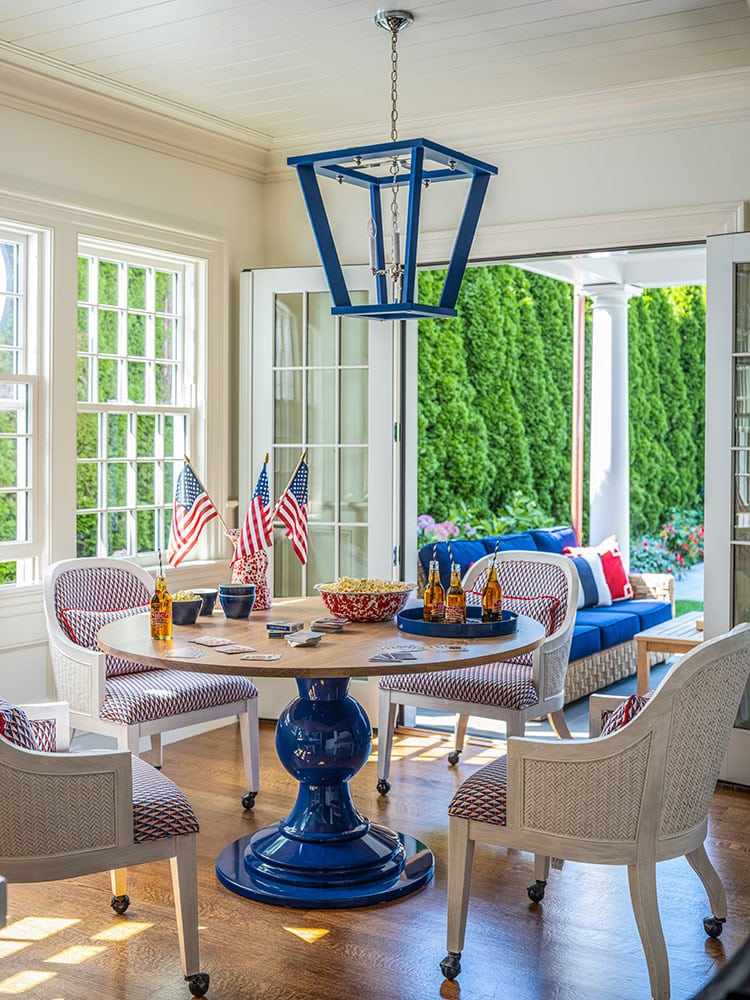
Adjacent to the main seating area, a versatile table serves multiple roles throughout the day—breakfast spot, children’s activity hub, game table, and entertaining station. It is a detail that speaks volumes about the home’s design philosophy: spaces should adapt to life, not the other way around.
From here, the interior extends effortlessly outward. A long covered porch—part veranda, part loggia—runs along the back of the house, creating a shaded transition between indoors and out. With ample room for dining, lounging, and gathering, it becomes a natural extension of the living space during the warmer months.
“It’s really where everything comes together,” Mattison says. “You can move in and out easily—it’s just a great way to live in the summer.”
Moments of Bold Expression
While the home’s overall palette is carefully controlled, Mattison introduces moments of heightened expression that add depth and personality.
A lacquered blue library offers one such instance—a richly saturated space that serves as both retreat and statement. Balanced by textural elements and a sense of Vineyard informality, it avoids feeling overly formal, instead striking a tone that is both refined and approachable.
Nearby, a compact bar area delivers an unexpected burst of color. Wrapped in high-gloss raspberry red, it is all at once playful and sophisticated—a jewel-box space that reveals itself gradually, adding a sense of surprise to the home’s layout.
“It’s tucked away just enough that you don’t expect it,” Mattison says. “And then when you see it, it’s fun—it’s a moment.”
These elements serve as reminders that while the home is grounded in tradition, it is far from predictable.
Outdoor Living as a Central Experience
Beyond the walls of the main house, the property continues to unfold around a central pool, which anchors both the layout and the lifestyle of the home.
The pool is framed by thoughtful architectural elements, including the cabana—integrated into the garage structure—which provides a compact yet highly functional space for refreshments and relaxation. Its design ensures that even utilitarian components contribute to the overall aesthetic.
“It’s small, but it does everything it needs to do,” Mattison says. “And it adds so much to the experience of the space.”
Across the way, the guest house offers a quieter, more understated complement to the main residence. While it maintains the home’s overarching color story, its design is intentionally more restrained—creating a welcoming environment that allows guests to feel at ease.
“It’s still connected, but it’s a little more neutral,” Mattison explains. “It’s about giving guests a beautiful space without making it feel too personal.”
Together, these outdoor and auxiliary spaces reinforce the idea of the property as a complete environment—one designed not just for visual impact, but for lived experience.
A Home That Lives in Color
In the end, what distinguishes this Edgartown home is not simply its architecture or its interiors, but the way those elements come together to support a way of life.
Color, here, is more than a design choice—it is a unifying force, a thread that ties together generations, spaces, and experiences.
“It’s really about creating a place where everyone can come together and feel comfortable,” Mattison says. “A place that feels joyful, but also timeless.”
And in that balance—between vibrancy and restraint, tradition and interpretation—the home achieves something rare: a sense of authenticity that feels both rooted and alive.
A house that doesn’t just reflect its surroundings, but fully embraces them—infused with color, character, and the enduring spirit of Edgartown.
Julie Craven Wagner is the editor of Cape Cod HOME.


