


Making Memories
Cape Cod Home / Summer 2026 / Home, Garden & Design
Writer: Hannah Kunze / Photographer: Greg Premru
Making Memories
Cape Cod Home / Summer 2026 / Home, Garden & Design
Writer: Hannah Kunze / Photographer: Greg Premru
A waterfront home becomes the backdrop for generations of memories.
For many residents, a home in Scraggy Neck is more than a place to live; it’s a generational commitment, a shared slice of heaven passed down and cherished over decades. Perhaps this is why the young couple who purchased two lots in the late 1960s chose the peninsula to put down roots. All those years earlier, maybe they already dreamed of sharing summers with their grandchildren.
Sure enough, when their son started a family of his own, Scraggy Neck had been his “most favorite place in the world,” as he has exclaimed from the time when he was a child, it was a natural assumption that his children would be the next chapter in this generational legacy. Just over 20 years ago, he and his wife built their own home on the additional lot and filled it with a hodgepodge of hand-me-down furniture. Their plan had always been to one day renovate the house, and fully realize a place their family could gather for years to come—but the commitments of work and raising children afforded them neither the time nor the finances to put that plan into action just yet.
In 2024, the time was finally right. Architect J.B Clancy from Boston’s ART Architects had successfully helped the couple with the home where they had raised their family outside of Boston, so the call to consider the project was a natural first move. To execute the unique renovation and addition Clancy designed, Paul Pacella of Post and Beam of Cape Cod was chosen. To bring their vision to life, the homeowners knew there was only one person: Jocelyn Chiappone, owner and head designer of Digs Design Company, based in Newport, Rhode Island. For years, the homeowners had admired Chiappone’s work through social media. Their enthusiasm and trust combined with Chiappone’s vision and execution resulted in a project for the ages—a home filled with the character and charm they hoped would draw their family back for generations.
“These were simply dream clients,” recalled Chiappone. “They were trusting and let us guide them to new ideas. We had a lot of creative freedom and inspiring architecture to work with.”
For Chiappone, who believes that a home’s location and history are important to honor in its design choices, finding a balance between the family’s past and the future they envisioned proved challenging. “As much as we honored the past, we knew the transformation would be significant,” she recalls. The result is a house that feels undeniably modern and fresh, yet rooted in classic Old Cape Cod style. Clancy’s program created an open layout to immediately introduce light and airyness to the space, while the new addition created a perfect transitional space to the dynamic landscape Scraggy Neck is known for.
The feeling of walking into a coastal retreat is apparent as soon as one steps into the entryway, where pickwick paneling covers both the walls and ceiling. Chiappone selected a pickwick paneling, reminiscent of the pine paneling frequently found in old Cape-style houses, to anchor the design in local history. Much like everything in the home, this was a purposeful choice: “I always suggest to clients that their summer home has a completely different feel than their main house,” says Chiappone. “We want clients to walk in and feel like they are on vacation.” A vintage chinoiserie cabinet in baby blue adds a splash of color to the crisp white entry, a hint of the vibrant spaces to come.
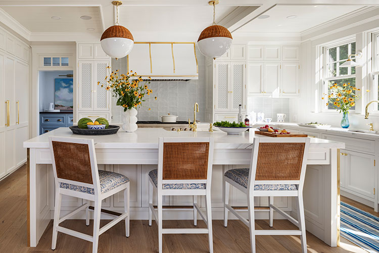
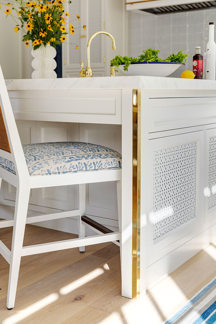
The pickwick paneling extends into the open-concept kitchen and living area just beyond. In these rooms, texture is king. A fully white kitchen, though classic, can easily feel one-dimensional without intentional design. Here, the white cabinets come alive with painted fretwork that matches the tiled backsplash. Brass hardware used throughout the room has a brightening effect while also serving a functional purpose. “The brass corners on the island have a luxe appeal, while protecting the corners from scuffing,” says Chiappone. “We also incorporated the brass into our hood design. I love designing a custom hood and I never repeat the same thing twice!” Above the sink, the nods to old Cape Cod continue with double-hung windows and ceramic sconces that provide a warm, natural glow.
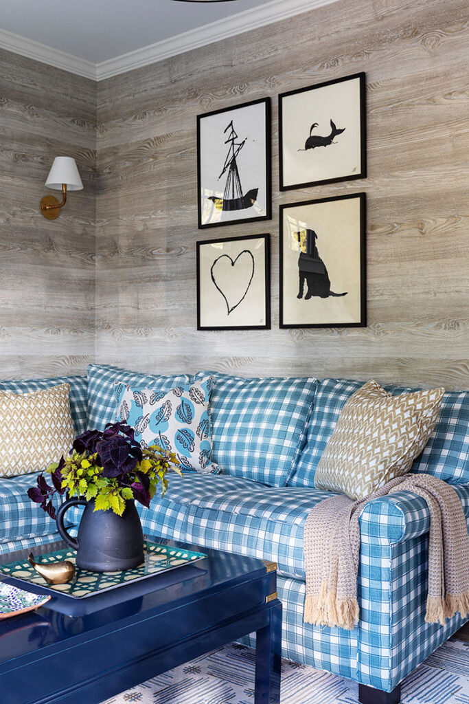
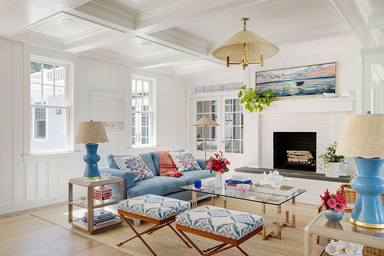
In the vibrant living room opposite the kitchen, no two textures are the same. The pickwick paneled walls and ceiling frame a painted brick fireplace around which the furniture is arranged. Atop the plush couch lie floral sofa pillows—a small but impactful design choice that inspired the room’s color story and concept. Their denim and berry hues are even replicated in the seascape painting above the mantel, hung to visually expand the room. These bold colors and patterns are balanced by natural elements like wicker, rattan, and sisal in the chairs, lighting, and carpet. “These elements ground the design while the bright backdrop gives the mix of pattern space to breathe,” Chiappone says.
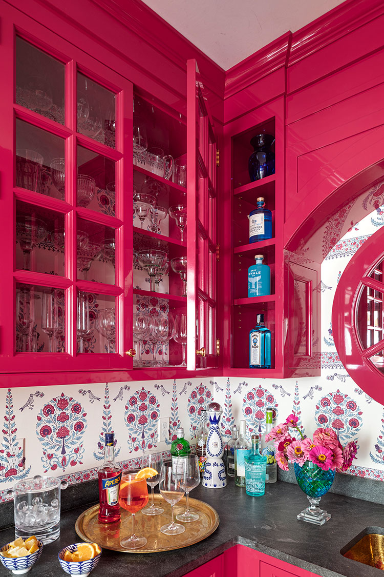
Digs Design is renowned for layering casual silhouettes, texture, and color, and the homeowners trusted Chiappone to deliver on all three elements. “When it came to color and pattern, they said yes to everything!” she recalls. Nowhere is the Digs Design footprint more evident than the pantry. With its raspberry hue, glass uppers, and patterned wallpaper, the space is awash with layers of color and texture. Chiappone has a soft spot for this particular space: “I love anything in high gloss,” she says. “It’s also a very durable finish. The Quadrille wallpaper has always been a favorite, and this was the perfect spot to showcase the print.”
Though the berry pink pantry is a personal favorite for Chiappone, these statement spaces are often unfeasible. The architecture of this home is uniquely suited for bold choices. “The design of our interiors always has a strong connection to the architecture of the home,” Chiappone explains. “Unlike open-concept houses, this layout has lots of separate rooms. These individual spaces gave us the opportunity to create color stories and celebrated designs with a greater wow factor than is often possible in open-concept homes.”
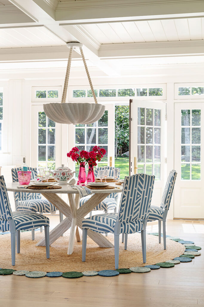
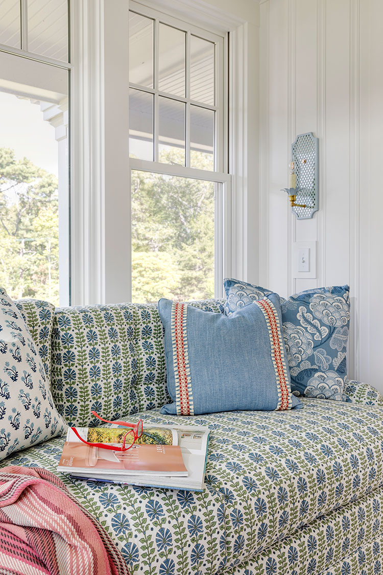
Tucked away behind the living room is another small space with outsized wow factor—a bright, cozy sunroom with sweeping views of Buzzards Bay. It’s easy to see why the space is a favorite spot for both the homeowners and their children. The custom sectional, triple-measured to ensure it fits like a glove beneath the picture windows, is the perfect perch for reading, relaxing, or simply watching boats meander past. Chiappone selected a small-scale print for the piece, which feels lighter than solid color in compact spaces. A wave pendant that hangs from the ceiling adds to the impression that this space is neither fully indoors nor outdoors. The fixture was custom painted in Farrow & Ball “Parma Grey,” a color that is repeated throughout the home. In the mudroom, the millwork is painted in that same shade, a playful departure from the rest of the home where the pickwick paneling is bright white.
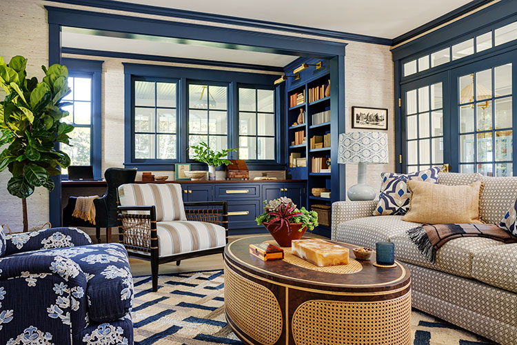
Next to the sunroom, a library that feels nothing short of regal plays triple duty as office, game room, and reading room. The grasscloth wallpaper, rope chair, and caning on the coffee table provide a masculine take on the coastal theme. Brass fixtures appear again here, shining against the navy blue millwork and matching the abaca rug. Amid so many stunning details, it’s hard to choose a centerpiece—but the custom game table has a strong claim. Handmade by the Digs Design workroom, this one-of-a-kind piece was crafted from a Bastideaux wallpaper.
The homeowner eagerly wanted an office space with views of a nearby lighthouse, but the library lacked windows offering an unobstructed view. The only window that did was tucked in the corner of a cramped alcove. Undeterred, Chiappone transformed the space from a moody corner into a private office retreat by installing a built-in desk that seamlessly transitions into a shelf, connecting the workspace to the rest of the room. The primary bedroom and hallway also incorporate secluded seating nooks, offering a moment of peace away from central gathering places.
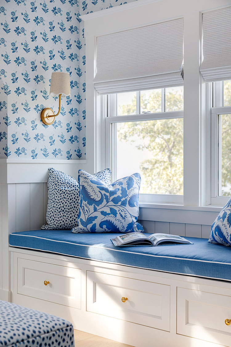
In the primary bedroom, Chiappone executed a quintessential blue and white coastal color palette with Digs’ signature pattern play and texture layering. At one set of windows, a built-in bench offers a chic seating area; at the other, drapes with a handmade blue scallop detail frame a charming vignette. Floral patterns on the walls and bedding add softness while alluding to the Cape Cod vernacular. “I love adding vintage items to a room to create a sense of place and collected quality,” Chiappone adds. “The wicker lamps were a great find, and I added custom shades in the fabric to match the wallpaper.”
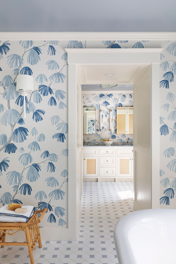
Adjoining the bedroom, the spacious primary bathroom carries on the blue and white theme. The size of the room allowed Chiappone to use a Schumacher large scale Weeping Pine on the walls. Its many shades of blue are emphasized and repeated in the floor tiles and patterned window shades.
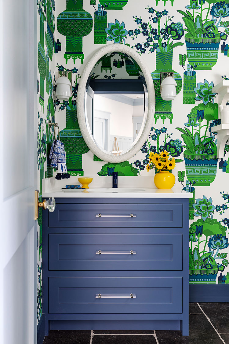
Each of the home’s five bathrooms has a distinct personality. The primary bath is a sanctuary for relaxation. The guest bathroom is bold: the ceramics pictured in the vivid wallpaper are replicated in real life on floating shelves. In the sons’ bathroom, navy millwork, metal sconces, and a mirror shaped like a ship’s wheel provide a boyish playfulness. Both the powder room and the daughter’s bathroom feature blue floral wallpaper and mirrors flanked by sconces —but while the former embraces cool silver tones, the latter glows in warm, feminine gold.
In a house designed with future generations in mind, the children’s bedrooms are particularly timeless. These rooms are tasteful at every age, and just as appropriate for a child born in 2010 as for one who will be born in 2040. In one boy’s room, pops of fire engine red offset the navy wainscotting and tan walls. A vintage wooden campaign chest and whale’s tail portrait provide a sense of place, rooting the room in its seaside locale. The second boy’s room leans more unconventional with its green grasscloth walls—a design choice that initially gave the homeowners pause. “The wife was a little worried about this room,” Chiappone says, “But we eventually decided to go forward with the material. She ended up loving the grass cloth even though she wouldn’t have known to pick it.” In the end, the subtly textured walls combined with mustard and denim-colored elements create a space with lasting appeal, reminiscent of summer days spent outside.
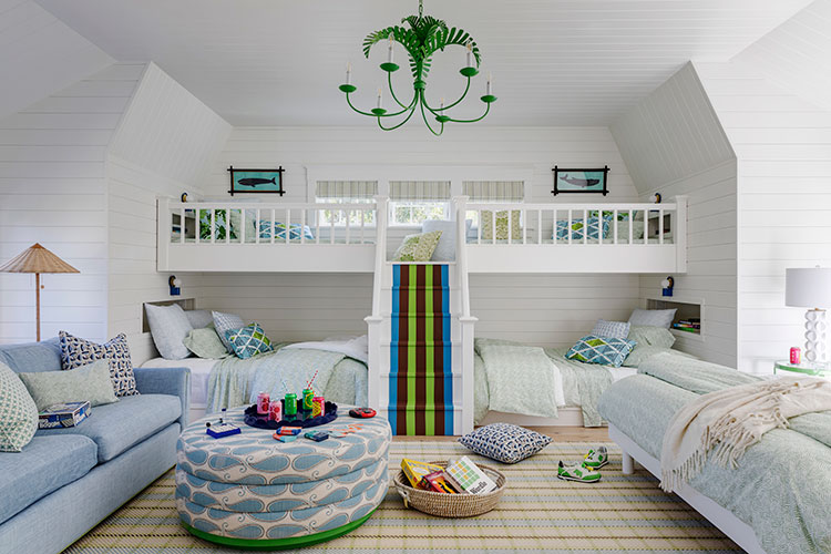
As classic as these rooms are, the house does have one unconventional bedroom. Tucked above the garage, the bunk room serves as a venue for epic slumber parties. With two sets of bunks, a queen bed, and a pullout couch, the room can fit countless people. Bringing this room to life wasn’t an easy feat—it was originally supposed to be unfinished, and lifting the furniture required the assistance of a forklift. But, in Chiappone’s words, “Our goal is creating joy,” and this is truly a room where joy prevails. From the painted stairs to the funky ottoman and the built-in shelves for trinkets and treats, this room is childhood bliss personified.
For decades, Scraggy Neck has been a constant for the family amid life’s sea of changes—and it will continue to be for decades more, thanks in part to the refresh provided by Digs Design. With its seamless integration of classic Cape Cod charm and bold, modern style, this beloved home overlooking the bay will be cherished for generations.
Hannah Kunze is a freelance writer for Cape Cod Life Publications.
